Archives

OUGD603: Brief 15 - YCN Yorkshire Tea // Further Design Development

 Additional analysis of some other tea boxes we picked up informed out design process, or at least allowed us to flesh out some ideas and explore additional concepts.


Looking at alternative ways of displaying the information which would be expected on the back of a Yorkshire Tea box, such as the brewing time and other information such as the net weight, or the tea blend. Perhaps even room to display the ethics and morals of the company. Adding the brewing time to the interior of the box adds a sense of interaction to the process of opening the box. 


Additional examples of tea packaging has been used to identity how over designers have displayed the content on the back of the packaging. Using oversized letters and numbers to draw attention to them, creating a feeling of hierarchy within the content. 


Adam and I also explored the idea of using a print within the contents of the box, so that when you open up the box, you're opening it up to the gorgeous Yorkshire Moors. 

OUGD603: Brief 5 - YCN Yorkshire Tea // Mock Up Construction

Following the design development seen in the previous posts, we looked into creating a mock up for our box, so we can really see how it will feel off the screen. How it looks, sits and works as an object. 

Based on our concepts and the net deconstruction, as seen in previous posts. We applied a rough design to the net, and sent it to print – as we had a print slot handy. 


The box uses a wrap around panorama, which captures the beauty of the rural Yorkshire landscape from every angle of the box – apart from the back, at this stage. Using the red back as a place holder for any copy or other content. 


The inside of the net, which mimics the original net of the Yorkshire Tea box, but at a smaller scale, to save on costs. We know the how big the full scale box will be, as we own plenty of the current Yorkshire Tea boxes. 


A shot of the box mock up, the beautiful Yorkshire landscape dominating the box. Perhaps washing out the modified logo or any other content. Perhaps a revisit of the box design would be beneficial, upon review.

However, we really love the red lid, a banner. We think it really brings a new dynamic to the box. Keeping the iconic red which is associated with Yorkshire Tea, but not obscuring the imagery. 


Further design development for the final boxes will follow. 


OUGD603: Brief 15 - YCN Yorkshire Tea // My Beauty Tea Research

As part of the research for Yorkshire Tea – I've begun to look at more 'quirky' tea brands, to see if there's anything which can be implemented into our Tea innovation project. I'm looking into the My Beauty Tea brand, displaying what they offer and their presentation. 


Initially, you can see that they're a very friendly brand – using hand rendered (or simulated) typography, which adds a hand crafted quality to their image. Hand crafted usually implies that they are unique, and made with care. 


They present their Tea infusions by shaping them into hearts – which adds a feminine connotation to the brand, if that wasn't already obvious from their name.


Another fun quality to their brand is their tea infuser – dubbed the Manatea. The quirky tea infuser adds an element of enjoyment to the company. You will want to brew their teas in the Manatea.


OUGD603: Brief 3 - SAC Ampleforth II // Wireframes

I've begun to create the wireframes for the website, starting with the home page. Although, during Work in the Web, at Mixd, I was taught to design for the mobile first – however, I completely forgot about that until I begun to write this post. 


Based on my research, I sketched out a concept for the home page, including quick links to the main content on the website – the classes, the fitness suite and the pool. Scrolling down, you're able to view details on the membership scheme and the pool – at the bottom there is a contact form. Adopting the modern style of a long one page website, sort of. 

The navigation has been designed to be hidden with a hamburger menu – which opens up to reveal the secondary and thirdary pages of the website. 


The wireframes in the illustrator document, set up using a twelve column grid, two variants have been created. One with a closed navigation, and one with an open navigation. As the two look very different, in a client situation I would have to show them what both states look like. 

Above pictures the navigation in it's hidden state, compressed into the hamburger menu, which is often used to help minimise a page's content – which is useful, as the navigation will be over an image. Removing the navigation will allow the image to dominate the page, becoming the main feature. 


The exposed navigation, which features links to every visible page on the website – for quick navigation. The hamburger in the top right also transforms into a X, as an option to close the navigation. 


OUGD603: Brief 16 - DBA – Capital North // Logo Animation

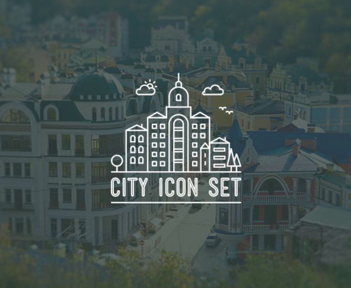
I'm working on the motion graphics for the project – creating an animation for the logo which we've created as a group. I plan to animate the logo in a manner where it 'comes together', which will represent the four cities coming together, to unite and work as one – the northern powerhouse!


A rough storyboard was created, to map out how the logo will come together. Each individual element will appear, and come together in the centre, the additional underlapping elements will then appear from underneath. 


As a change of pace, I decided to work in 60FPS at full HD resolution, 1920x1080px. Ordinarily, I would work at 27FPS at 1280x720px – the lower resolution HD. Doing this will allow for a smoother motion, you really can see the difference. Having a higher resolution would also create a sharper looking logo. In an attempt to make the animation as clear as possible for the presentation. 

This will also be beneficial, as it turns out we're presenting this in the lecture theatre...  Upscaling the animation to 4 metres high will result in a reduction of quality, a larger image would preserve some quality. 


The animation of the logo was made mainly using masks. Animating the mask to reveal the shapes in the icon. Doing this made the process much easier – as the overlapping in the centre would be tricky to animate correctly. 


The first animation – on viewing it, sharing it with the rest of the group, we wondering if having a slight pause, only for a few frames, would help the animation flow, as the idea is that the lines disappear behind the overlapping shapes, and then continue out the other side. However, seeing as the lines are comprised of two shapes, the transition under the overlapping shapes is instantaneous – which makes the shapes look disconnected, rather than one shape, weaving under the others. 


Above is the version with a pause.

Out of the two animation variations, the variant without the pause between the two phases – the lines coming together, and the second lines spreading outwards again. Works better, the pause almost looks like a jutter and an error in the animation. The fluid version without the pause works better. 


I threw the first variant into premiere to add the titles and some sound. I used the theme from Man of Steel as a placeholder, proper music, which would be more suiting to the animation will be sourced at a later stage. 


OUGD603: Brief 5 - No. 7 Antiques // Presentation Boards

After completing phase one of the design process, conceptualising the logos for No. 7 Antiques. I've presented them to the client – five of the logotypes which I felt were the strongest have been pitched to No. 7.


Awaiting feedback from the client, which will give me a chance to push forward with some other briefs for the year.

OUGD603: Brief 5 - No. 7 Antiques // Logo Development 03

On the back of previous logos, which have already been developed. Speaking to Ewan, whilst looking for some quick feedback, he suggested that four logos might not been enough – perhaps a fifth would be beneficial, giving the client more options. 


Basing the design from the font Lust Display, which is a very stylised font, very elegant and sophisticated with engaged elements such as the main stems within the typography. I began by making slight adjustments to the type. Lowering the glyph, shifting the baseline, so it sits within the typography. Which allows the 7 to sit in line with the Q, adding some fluidity into the title – rather than a striking cap height number. 

I also removed some of the thinner strokes, doing this uses negative space to suggest the shape of the typography. The stronger, thicker lines which still remain hold up the shape of the type – this is successful as the type still legible. 


OUGD603: Brief 13 - D&AD Pantone // Iconography Research


Copyright 2010. All rights reserved.

RSS Feed. This blog is proudly powered by Blogger and uses Modern Clix, a theme by Rodrigo Galindez. Modern Clix blogger template by Introblogger.