OUGD603: Brief 1 - SAC Ampleforth // Interior Mock Ups

At this stage, I haven't had chance to take any photos at SAC Ampleforth, so I've been using photos from Virgin Active Health Clubs to propose how the interior of the sports centre might look with the applied brand colours. It was particularly easy to do this with Virgin Active's interiors as they have strong brand application throughout all their health clubs - red everywhere.


Above pictured is one of the studios from Virgin Active in London, where they do ariel yoga - or something like that. They use red material to echo the brand in the class.


To make them green quickly, I used the colour range tool in Adobe Photoshop CC 2014 - I was able to select all the red elements in the photo, which I could then use the selection to manipulate the red and make it green to fit SAC Ampleforth's brand colours. 


I did so using a Hue/Saturation layer mask to manipulate the colour in a none destructive fashion, so I can edit it later on if I so need to. This also allows me to control the Hue and well as the saturation of green to get it as close as possible to the green of SAC. 


Green material, which echoes the brand colours of the freshly branded St. Alban's Sport Centre. I also applied this method to various other images to generate a strong proposal for how the sports centre would look. 


OUGD603: Brief 14 - Something More // York Minster Scaffolding Mock Up

As part of this brief I want to change how the council is viewed. To do this I feel like I should apply the brand to elements of the city which will be considered 'good', or beneficial to the community. Associating the council with positive developments.

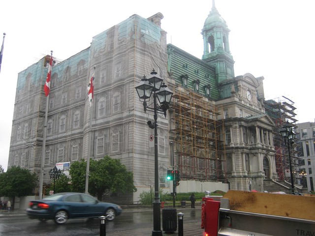
An example of this is York Minster, the pride and joy of York which tourists travel thousands of miles to see. However, it's always covered in scaffolding, which obscures the look of The Minster, making it look like a building site. 


Some research has brought me to see examples like this, using the a screen to cover up the scaffolding and the works beneath it, almost restoring the looks of the building while it's in a fragile state. 


I decided to apply it to York Minster. I found an image of the scaffolding which obscures the left tower, hiding it from display, exposing the ugly scaffolding, which is an eye sore spoiling the skyline of the city. 


I mocked up a cover for the tower, using the tower to the right and manipulating it onto the left tower to act as a cover, obscuring the eye sore which is the scaffolding. I applied the brand colour to the image which resonates the brand whilst rectifying the skyline, positively promoting the council - I added the logo just to increase the brand exposure. 

OUGD603: Brief 14 - Something More // Logo Devepment


Below is a very low resolution GIF which shows how the two logos are interchangeable and work together to fit the content and the space around it. 


OUGD603: Brief 1 - SAC Ampleforth // Class Icons 01


The new classes for SAC Ampleforth are reduced versions of the original classes, refined to focus on the health needs through natural movements - and spinning classes. Using imagery intertwined with the logotype for each class, the logos stand out and work individually. Being able to stand alone, but also work in a set. 

OUGD603: Brief 7 - Coffee Culture // Mug Mock Up


Copyright 2010. All rights reserved.

RSS Feed. This blog is proudly powered by Blogger and uses Modern Clix, a theme by Rodrigo Galindez. Modern Clix blogger template by Introblogger.