OUGD603: Brief 5 - No. 7 Antiques // Further Logo Development

Following the logo development in a previous post, I began to make more tweaks to the logo, in a similar style to before – duplicating a logotype, making an alteration and then duplicating it again. 

I first added in a sense of alignment to the logo, how it sits on the page. The spacing displayed above using a gird system to show how it works. 


I then tightened up the kerning across the board, making the spacing between the 'No' and the '7' tighter, and tweaking that of the 'Antiques'. 


Adding a serif to the 7, which worked in another variation of the logo, and it seems to fit really well here. It adds a rustic old feel to the type, pulling it away from the modern clean san serif font. 


On the back of wanting to create more of a distressed look to the typography, I added a distressed texture to the font, which created worn look – giving the logo some history, like the antiques which would be sold within the shop. 

OUGD603: Brief 5 - No. 7 Antiques // Logo Development

Since I've not really touched this brief in around a month, I decided to have a quick logotype critique.  Looking at the logotypes with fresh eyes, I should be able to spot any issues pretty quickly, before I go back to make any changes. 


Issues with spacing, the kerning between the I and the Q needs tightening up. The spacing between the zero and it's stroke need sorting, perhaps making it half the spacing of the vertical space between the N and the zero. 


Because of the angles of the 7 and the A, are both leaning to the right, the kerning need tightening up a lot, so the space between the two letterforms appears equal. I'm not sure the block filled EST works either, as it's very overpowering. 


Perhaps making the close together serifs into a ligature, which would perhaps make the type flow better – something which I picked up from Chris Murphy during the Work in the Web workshop. 


Adjusting the spacing between the veracity aligned, centred logos so they work coherently based of some sort of formula. 


More kerning tweaks – the spacing between the 0 and the 7 need tightening up. 

No massive overhauls, just small things which could be altered to improve the overall aesthetics of the design. 

OUGD603: Brief 5 - No. 7 Antiques // Initial Logo Development

Following a slight change in direction for the year, I've swapped on of my briefs – POG, and replaced it with No. 7 Antiques. A brief I originally attempted in the responsive module during second year, however due to the lack of time, and ability, almost. I really wasn't happy with the finished product. 

In relation to my design process, I decided to try a different approach to how I would design the logo. I'm always looking for different design process, I think they're really interesting. Seeing how overs work, seeing how their process differs to my own, comparing the two - add seeing how I can implement elements of other's workflow into my own. In a way, this brief is almost experimental in that sense. 

I found Aaron Draplin's video on how he designs a logo. 


I've attempted to implement elements of this into my design process, mainly the initial development, writing out the logo over and over again, making alterations to each variant, as you can see below. 


I first began to write out the name of the business, No. 7 Antiques. Changing the weight, the case, the spacing the alignment the font style, to see if anything sparked, if anything stood out. The raised zero, which was then aligned to the cap height using a stroke raising it from below, looked quite vintage, which fits with the brand. 


Further developing the look of the logotype, working with how it will sit, justify and align. The use of typography decoration has been applied to see if it might add anything to the logotype. Particularly liking how the logotype third down on  the left looks, using a stroke to almost underline the logo – which may look better aligned with the No. 7, but I'll tweak that when I move to the machine.


Finally playing with tag lines and subtitles in the logo, trying to find some way they can work together. Also exploring framing, content boxes which the logo might sit within – not that these really work, but it's better to get them out the way sooner than later. 


I then took the logos into illustrator, taking the few which I think worked or had potential, initially. I created the first logo, and then duplicated it, made a slight change, developing a small aspect of the logo and I then duplicated it again, making another change – and so on. At this stage, a lot of the design decisions are based on 'what if's, like what if we made this bold, or increased the spacing. 


Then creating another set of logos in a different typeface, you can see how I've moved from one variant to the other. I added a hanging serif to the 7, which gave the typeface a fuller look, whilst also adding a vintage feel to the logo, as opposed to a modern clean typeface. 

OUGD603: Brief 1 - SAC Ampleforth // Interior Mock Ups

At this stage, I haven't had chance to take any photos at SAC Ampleforth, so I've been using photos from Virgin Active Health Clubs to propose how the interior of the sports centre might look with the applied brand colours. It was particularly easy to do this with Virgin Active's interiors as they have strong brand application throughout all their health clubs - red everywhere.


Above pictured is one of the studios from Virgin Active in London, where they do ariel yoga - or something like that. They use red material to echo the brand in the class.


To make them green quickly, I used the colour range tool in Adobe Photoshop CC 2014 - I was able to select all the red elements in the photo, which I could then use the selection to manipulate the red and make it green to fit SAC Ampleforth's brand colours. 


I did so using a Hue/Saturation layer mask to manipulate the colour in a none destructive fashion, so I can edit it later on if I so need to. This also allows me to control the Hue and well as the saturation of green to get it as close as possible to the green of SAC. 


Green material, which echoes the brand colours of the freshly branded St. Alban's Sport Centre. I also applied this method to various other images to generate a strong proposal for how the sports centre would look. 


OUGD603: Brief 14 - Something More // York Minster Scaffolding Mock Up

As part of this brief I want to change how the council is viewed. To do this I feel like I should apply the brand to elements of the city which will be considered 'good', or beneficial to the community. Associating the council with positive developments.

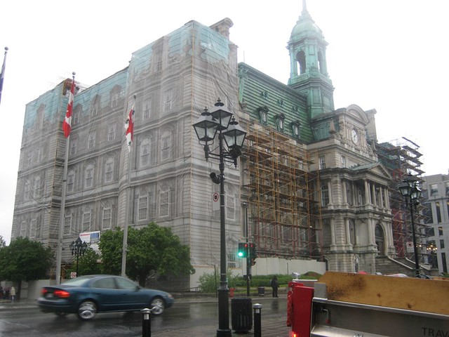
An example of this is York Minster, the pride and joy of York which tourists travel thousands of miles to see. However, it's always covered in scaffolding, which obscures the look of The Minster, making it look like a building site. 


Some research has brought me to see examples like this, using the a screen to cover up the scaffolding and the works beneath it, almost restoring the looks of the building while it's in a fragile state. 


I decided to apply it to York Minster. I found an image of the scaffolding which obscures the left tower, hiding it from display, exposing the ugly scaffolding, which is an eye sore spoiling the skyline of the city. 


I mocked up a cover for the tower, using the tower to the right and manipulating it onto the left tower to act as a cover, obscuring the eye sore which is the scaffolding. I applied the brand colour to the image which resonates the brand whilst rectifying the skyline, positively promoting the council - I added the logo just to increase the brand exposure. 


Copyright 2010. All rights reserved.

RSS Feed. This blog is proudly powered by Blogger and uses Modern Clix, a theme by Rodrigo Galindez. Modern Clix blogger template by Introblogger.