OUGD603: Brief 04 - The Last Drop // Pattern Research

Mid way through the logo design, I've come across a lot of empty space which I need to fill. Based on the research from the Treboom brand, a pattern may be beneficial to, a welcome addition to the design which helps flesh it out.

Hopefully making the design much more intricate and sought after. Often my logos are very simple and minimal, designed using rules and ratios to get that 'smart' look. Whereas I would like this logo to be something which is looked at, stared at, up close. Taking in all it's detail.


Using two different sets of patterns triangulated together to create a detailed and tricked pattern which spreads across the background of the image. The detail of the pattern really draws you in to appreciate the design around the main content on the page. However, it doesn't distract from the main content, and that's important to bear in mind. 


The pattern on the aces of spaces, pictured above. Has an extremely detailed pattern printed within the shape. So detailed in fact, that I'm positive that if you stand back from the design, it all just blends into one colour, of sorts. Which is what I'd like to achieve with design and the pattern of The Last Drop logo. 


Pictured above is a GIF looping a series of ribbon based patterns, a very retro style. As nice as they look, I'm not sure the ribbon pattern would work with this project. They come across as a very fun and light hearted pattern, which is almost the opposite of what I would like to achieve. 


OUGD603: Brief 09 - Coffee Culture (Website) // UX/UI Further Research (Engage Prague)

Which conducting some research for Coffee Culture's web brief, I found this lovely UI and UX demonstration for Engage Prague on Dribble from Jaromír Kavan. You can see the live version here.

I'm treating this project as a small case study, into how this website has been designed and presented, as it is only a mocked up version – which is exactly what I'm doing for this project. Below is a GIF animation, which shows the UX journey and the entirety of the micosite. 


Using a circle, to show the mount pointer, the clickable items, the roll overs and how the website scrolls down the page. How the mouse circle pulses to show a click, disappears briefly to display the content, when the mount would be still. It's a lovely bit of design in itself. 


The homepage has a compressed hidden menu, disguised behind a hamburger. Which opens up to show the menu.


You can see the roll over for the hamburger menu, which uses the neon green/blue which can be seen all over the website, little details like this really tie in the website as one consistent piece of design. 


You can see how the menu which exposed appears on the page, overlaying the content. The main items have been dulled out, with a reduced contrast of tone. Which helps make the cross and the current page stand out more on the menu in comparison. Which both have a greater tonal contrast to the background. 


The navigation of the website when the menu has been collapsed is very interesting. As the website is a vertically scrolling microsite, a vertical button navigation has been added, to show the sections of the website. Not only showing you how far down the page you are, but also a quick navigation to the individual sections. 


Each section of the website is responsive, which makes it fill the full size of the screen – edge to edge, both vertically and horizontally. A quick scroll with the mouse acts as a full power scroll, transitioning you to the next section automatically. It's wonderful, and so easy to use. 


OUGD603: Brief 03 - SAC Ampleforth II // Tablet Screen Wireframes

As this website is being designed to work responsively, I'm designing how the home page will look on an tablet screen. How the content will adjust to fit, responding to the dimensions of the page. The design of the tablet will be used to bridge the up-scaling gap between the mobile and desktop versions of the website. 


Similar to the mobile version, the portrait view of the web page will adjust so the content fits the page in the best possible manner. 

Horizontal content areas, taking the full width of the screen will be used which will allow for the best area of 'click ability'. Rather than a quarter of the page vertically, you may tap the wrong area. This will also reduce the length of the page, so there's no endless, thin and long scrolling parallax pages. 


Similar to the desktop version, the landscape tablet uses vertical columns more predominantly, in comparison to the portrait version of the tablet screen. Taking advantage of the width of the screen. Displaying the content more sporadically, rather than being stacked. 

OUGD603: Brief 04 - The Last Drop // Route Map Animation Completion

I have been finally able to complete the route map for the pub crawl, using adobe after effects. Which has been created using a layer mask, which hides the content which it masks. By animating the anchor points of the layer mask, I've been able to reveal the route in stages, point by point.


Doing it this way, using a mask, allows for no destructive animation. Being able to show and hide elements of the animation at any point.


The image above shows the paths used to reveal the map, on the very last frame of the animation. Each anchor point was revealed individually, so the mask follows the route around the map, revealing it point by point – difficult to explain, but I'm sure the video below will show you what I mean. 


OUGD603: Brief 10 - Japan Rugby World Cup // Japan Culture Research 01

I thought I would look more into the Japanese culture as part of this brief, to get a better idea of what aspects modern Japan could be applied to the development of the brief.

Obviously, I'm unable to travel to Japan, due to finances and such. However, I'm able to do plenty of primary research on the matter.

Future of Transport

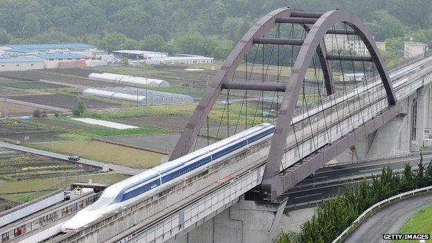
I stumbled upon a post on the BBC website. An article talking about a new world record set my Japan's Maglev train. Which reached a top speed of 603 kph (374 mph).
Unlike traditional trains, maglev trains work by using magnets to push the train away from the tracks and drive the train forward. 
Japan's maglevs don't use metal tracks — instead, they float nearly 10 cm (4 inches) above special guideways, allowing for frictionless movement.
Stuff of science fiction films! Trains which levitate above the ground, allowing for high speed travel.


OUGD603: Brief 04 - The Last Drop // Primary Research

Accidental primary research, whilst out for lunch with United by Design. We went to Brigantes in York, which is often on the pub crawl. When handed a menu, I noticed this icon on the top right of the sheet. 


Using a bold red stamp style, and rounded typography which fits within it, the icon beautifully conveys the associations name, and all the relevant information. Using different sizes and weights to display a hierarchy of information. 

The association represent 'good pubs', put briefly. the stamp reflects a physical 'seal of approval'. A stamp added to approve something.
 

Copyright 2010. All rights reserved.

RSS Feed. This blog is proudly powered by Blogger and uses Modern Clix, a theme by Rodrigo Galindez. Modern Clix blogger template by Introblogger.