Showing posts with label Brief 10 - Japan Rugby World Cup. Show all posts

OUGD603: Brief 10 - Japan Rugby World Cup // Iconography Development 01

To accompany the logotype, which Ewan is working on. I've begun to develop an icon/symbol which will embody Japan and it's culture, the ultra-modern developing world and the Rugby world cup. I've attempted to intertwine the two together, quite literally. 


Using the levitating maglev train, and elements of the Tokyo skyline – both urban and natural, to take the form of the Web Ellis Rugby World Cup trophy. Using Mount Fuji to create the dome of the cup, and the maglev train spiralling up the trophy. 


An additional annotated screenshot of the illustration, with additional element such as the the Tokyo skyline and the smoke from the volcano. Which mimic aspects of the trophy. I will transfer this into illustrator to create a vectorised, improved and more precise version of the illustration. 

OUGD603: Brief 10 - Japan Rugby World Cup // Japan Culture Research 01

I thought I would look more into the Japanese culture as part of this brief, to get a better idea of what aspects modern Japan could be applied to the development of the brief.

Obviously, I'm unable to travel to Japan, due to finances and such. However, I'm able to do plenty of primary research on the matter.

Future of Transport

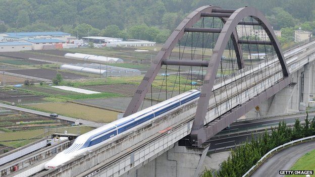
I stumbled upon a post on the BBC website. An article talking about a new world record set my Japan's Maglev train. Which reached a top speed of 603 kph (374 mph).
Unlike traditional trains, maglev trains work by using magnets to push the train away from the tracks and drive the train forward. 
Japan's maglevs don't use metal tracks — instead, they float nearly 10 cm (4 inches) above special guideways, allowing for frictionless movement.
Stuff of science fiction films! Trains which levitate above the ground, allowing for high speed travel.


OUGD603: Brief 10 - Japan Rugby World Cup // Further Logo Development

After some sizeable time off this brief, due to other group projects and competition briefs – all with earlier deadlines, Ewan and I put this brief on hold for a few weeks. We're just gotten back into it.

We had failed to decide on a logo for the RCW 2019 Japan, so we spent a couple of hours putting together designs and quick animation concepts for the logo. 


We tried to manipulate the Japanese flag, taking the red solid circle and transforming it into something which represents the sport of rugby. Adding rugby posts, well, subtracting them from the red circle to see if we could create any sort of effect. 

They are quite interesting, very simple. However, we don't feel that they're vert strong. They lack any real application and longevity due to their simplicity. If the lines are too thin, the design doesn't work on a small scale, if the lines are too thick you lose the shape of the circle. It just wasn't really working. 


On the back of that, I jumped into after effects. In the earlier sketches, we played with the idea of transitioning the red circle into the shape of a rugby ball. Experimenting with how that could then interact with other objects and typography to further suggest the theme of rugby. 

OUGD603: Brief 10 - Japan RWC 2019 // RCW Logo

As part of the branding of the RWC, the IRB RCW logo has been used consistently throughout all of the RWC's over the past thirty years. It's an essential part of the brand, so it needs to be updated to fit the 2019 brand. It's a simple as changing the type t fit the new venue. 

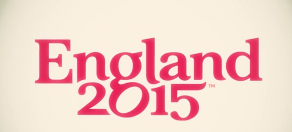
I managed to find an EPS of the 2015 Rugby World Cup logo, England. The EPS format made the logo editable.


I had to source the typeface for the logo, but it wasn't available. I managed to find out that it's a private typeface, not available for purchase made for RWC. It's called rwc_regularregular or something like that. 

In order to source what the letter form would look it, I had to find a way to sample the font. Unfortunately, I didn't screenshot this. I visited the RWC website, which used the font for the copy. I used the inspect element tool on chrome to view the HTML and CSS of the website. I altered the HTML to read 'JAPAN 2019', which displayed what the letterforms look like. Zooming in to get the highest resolution of type, and then took a screenshot of it. 


I then imported the screenshot into illustrator, and traced the type, applying it to the original logo, to create new logo. 


OUGD603: Brief 10 - Japan Rugby World Cup // Logo Development

I began to work on the logo for the world cup today. The research I've previously conducted has lead to the initial design work, which is really just playing with some ideas at this stage - nothing too refined. Ewan and I are working separately at this point, and then we will come together to combine our idea, or pick the best one.


I sketched out the rugby world cup trophy, and some Japanese type which just says rugby - also playing with other Japanese symbolism such as the rising sun and temple/dojo/houses. Just to get a feel of some things we could incorporate. 


And a Japanese Pavilion. 


Because I can imagine we'll be using the trophy at some point during the design phase, I Neubau'd the outline of the trophy in Adobe Illustrator. Which I can then give to Ewan if need be later on in the design phase, if he needs it. 


From some initial research, we've noticed that Japanese type is written in a number of different manner, but to make it more distinctive in comparison to how we as westerners write, from left to right, we are going to use from top to bottom. The Japanese also write from right to left, however, western developed eyes might struggle to read from right to left. 

The type above reads 'Rugby World Cup Japan'. However, this is quite long winded, especially for a logotype. A shortened version would be more appropriate. 


This is a shorter version, the type simply reads 'rugby', however if you were to say what the icon is it would read as 'Rugby World Cup Rugby', which doesn't make sense. 


The version above reads 'Rugby World Cup Japan', if you read it with the symbol, which works better in my opinion. The logo is very simple, but that's no different from previous RWC logos in the past, as my research has shown. I still want to develop this further, perhaps experiment and play with the typography. 

On the back of this, I created a look and feel image, to show how the type might sit - this isn't final.

OUGD603: Brief 10 - Japan Rugby World Cup // Planning and Ideas

Today Ewan and I started to book in some time to work together on our collaborative brief, which is designing the identity and promotional material for the 2019 RWC Rugby World Cup in Japan. 

We're basing the vast majority of the existing content produced for the 2015 Rugby World Cup, which is being held here, in the UK. As all the 2019 World Cup will be is another version of previous World Cups - however, we would also like to push the boat out, and see what we can come up with in addition to this, so we can propose the most visually innovative Rugby World Cup yet. 


We began by mapping out the content found in existing Rugby World Cups, so we're able to divide up the roles effectively. Ewan is a print designer - and I'm more leant towards web design - but we both work on branding and identity design. So I imagine the initial stages will be a very side-by-side frequently meeting collaboration, until we get the overarching identity sorted, which will be mapped out into brand guidelines, then we would crack on, on our own, in our own specialisations. 


We threw together some initial sketches and ideas, un-research and unrefined as it stands, none of this would be final of course, it's just playing with thoughts. Taking elements from the rugby world and the Japanese language and trying to see if there's any obvious connections or synergy we can create or discover. 


Ewan and I also looked at some stuff on some design blogs and websites - just initial research, to see if we can gain any interesting ideas or views from any of the work. Below is some Chinese typography, not Japanese - but the glyphs take on a similar eastern style. 


The typography has been deconstructed and broken down into it's separate elements, and to us, this looked like a team strategy plan - the method in which the coach communicates plays to the team before a match. 


A really bad example I've found on Google images, but it demonstrates the point. 


Similarly, the layout of the typography is similar to a line of play in Rugby. In Rugby, the ball must travel backwards at all times, so the team assembles themselves in a diagonal line, players moving further back by each person - so the ball can be passes down the line, without forward passing.


Another image to demonstrate what I'm failing to explain...


Copyright 2010. All rights reserved.

RSS Feed. This blog is proudly powered by Blogger and uses Modern Clix, a theme by Rodrigo Galindez. Modern Clix blogger template by Introblogger.